A concept for the website - beyond the brand elements using web service data, the website itself would use this information to pull in appropriate content. A 'Summer' and 'Autumn' example are shown here, but in practice, would intend the website to be much more dynamic with a range of content appropriate for any season and weather variation.
Thursday, 29 July 2010
Thursday, 22 July 2010
Adaptive brand
For a second micro-project, I chose to look at a re-brand for a local woodland community trust, creating an identity that reflected the changing use of the woodlands throughout the seasons. This would continue my initial investigations into adaptive techniques from the 'MA brand' and would allow me to look at external data and how this could be used to define visual elements.
The logo shown here would change in relation to web service weather data. Whilst only shown in four states (one for each season), the logo would include a full cycle of 'growth' and would change dynamically in relation to the data source.
The logo shown here would change in relation to web service weather data. Whilst only shown in four states (one for each season), the logo would include a full cycle of 'growth' and would change dynamically in relation to the data source.
Tuesday, 20 July 2010
MA 'adaptive brand' show concept
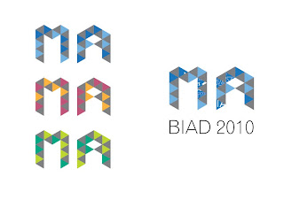
A concept for the MA show theme, based upon adaptive visual elements.
The logo represents the various elements that go together to form the Masters course of study. An adaptive, personalised version of the identity elements would be used for each individual student.
The grey sections represent the core area of study within the MA course whilst the coloured section represents an individual area of practice (AOP) within the course. This would vary according to which AOP the individual student was studying.
Finally, the typographic logo framework is completed with sections that become representative of the students own work.
Following the identity examples, are a few ideas of how other visual elements could continue the theme.
Subscribe to:
Comments (Atom)


