
Wednesday, 30 June 2010
MA Proposal
Further to feedback from my initial presentation, I've chosen to refine my area of investigation, concentrating on looking at a number of areas of interest.
This includes adaptive branding, but investigating how such techniques may be used within the context of 'brand as platform', as discussed by Wolff Olins (http://www.brandnext.com/). This will take the form of an investigative project, looking at how data created within the plaform may be used to define the 'look and feel' elements of the brand in a manner that hopefully isn't abstractly related to the audience.
Friday, 25 June 2010
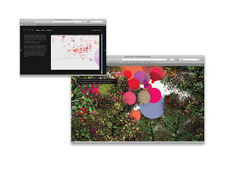
MA Proposal Presentation
A few slides from my initial MA proposal presentation. Will revise the research question over the coming week.


Tuesday, 8 June 2010
MA - Semester 3
Following on from semester 2, I intend to concentrate on branding again for this semester.
With a remit to look at (and move beyond) current developments within the field, adaptive branding projects over the last couple of years have piqued my interest and will offer an engaging area of practice to focus on for this last part of my MA.
Currently reading everything by Wally Olins, looking at Wolff Olins, Digit, Tomato etc...
Sunday, 16 May 2010
Pen Room - Finals


Friday, 14 May 2010


Wednesday, 12 May 2010
Pen Room - Finals
Finals for the Pen Room project, as presented to the client, and for submission for the Visual Practice 2 module of my MA.
The branding was intended to tie all points of contact with the public together under a clear house style. This was in response to their current branding across various touchpoints with a range of visual styles and logos.
The nib motif along with handwritten words are used throughout the collateral material to reiterate the purpose of a nib whilst tying it to the brand. A limited palette was chosen that was inspired by some of the period packaging material within the museum.
The museum cabinet booklet and text were revised to offer clearer points of entry into the document. The use of simple pen and ink illustrations break up this text heavy document, whilst making reference to some of the more obscure items within the museum cabinets.
Clear signage was created using the brand elements. External posters were designed to draw attention to the museum at the first point of contact upon the street. Simple internal signage was created that would stand out in the crowded museum environment whilst reiterating the identity for ease of recognition.
The museum's activities for children were revised to take better advantage of content of the museum and to be more educational (and hopefully fun too!). The use of the highlight cyan colour separated these activities from general museum signage and documentation.
Overall the client was very happy with the project and will look at implementing it, following board approval, within the next couple of months.


Friday, 7 May 2010
Moseley Shoals - Logo Usage
I produced a small 3 page document giving guidance in logo usage, colour palette and font, to maintain a cohesive 'brand' style for future marketing material.


Subscribe to:
Posts (Atom)