The Visual Practice module for this semester concentrated on looking at branding in more detail, following on from some of the Shoals work already started. I was interested in how branding is obviously more than just a logo and how a brand 'story' can be communicated through its various touchpoints.
I approached a local museum, which offered a great opportunity to look at rebranding an organisation with a wide range of needs. The Pen Room is a small charitable museum charting the history of pen nib production within Birmingham.
Sunday, 28 March 2010
Saturday, 27 March 2010
Moseley Shoals - Logo
Further refinement of the logo, and process of narrowing them down with initial feedback from external sources.
Thursday, 25 March 2010
Moseley Shoals - Logo
Working up some of the rough pencil ideas into vector form... Some work better than others when digitised.
Saturday, 20 March 2010
Moseley Shoals - Logo
Whilst the current Moseley Shoals logo is adequate, I was keen for the purpose of this project to look at rebranding the organisation.
Its current 'wave form' logo may also be too connotative of swimming, which they were keen to address. Looking at the groups various activities, I wanted to retain a water element within the logo but not include anything that would make the group appear too sports orientated.

Its current 'wave form' logo may also be too connotative of swimming, which they were keen to address. Looking at the groups various activities, I wanted to retain a water element within the logo but not include anything that would make the group appear too sports orientated.

Friday, 12 March 2010
Moseley Shoals
Planning a major identity project underway for the other part of the course, I've decided to look at another identity/branding project for the Reflective Practice 2 module. Using the project to gain further experience prior to the main Visual Practice 2 module this semester, I wanted to look at a small, local organisation and approached my local swim group. They kindly agreed to take part in the process.
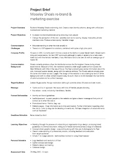
Attached is the brief, drawn up in collaboration with the client. Moseley Shoals is a small, independent swim group for the LGBT community. They currently use a range of marketing items (leaflet, website etc.) to publicise the group.
Subscribe to:
Comments (Atom)


